
Crust Bakery
Freelance

%20%7B%20%20%20%20animation-timing-function%20cubic-bez-2.png)
The Crust project focused on creating a cohesive brand identity for a sustainable bakery in the outer Bristol area.
I designed a logo, sub-marks, and sustainable packaging made from recycled materials, as well as a new business card, social media adverts, and templates. To support their digital presence, I developed an easy-to-follow social media plan. Every element reflects Crust’s commitment to sustainability, quality, and community, blending earthy visuals with thoughtful design.


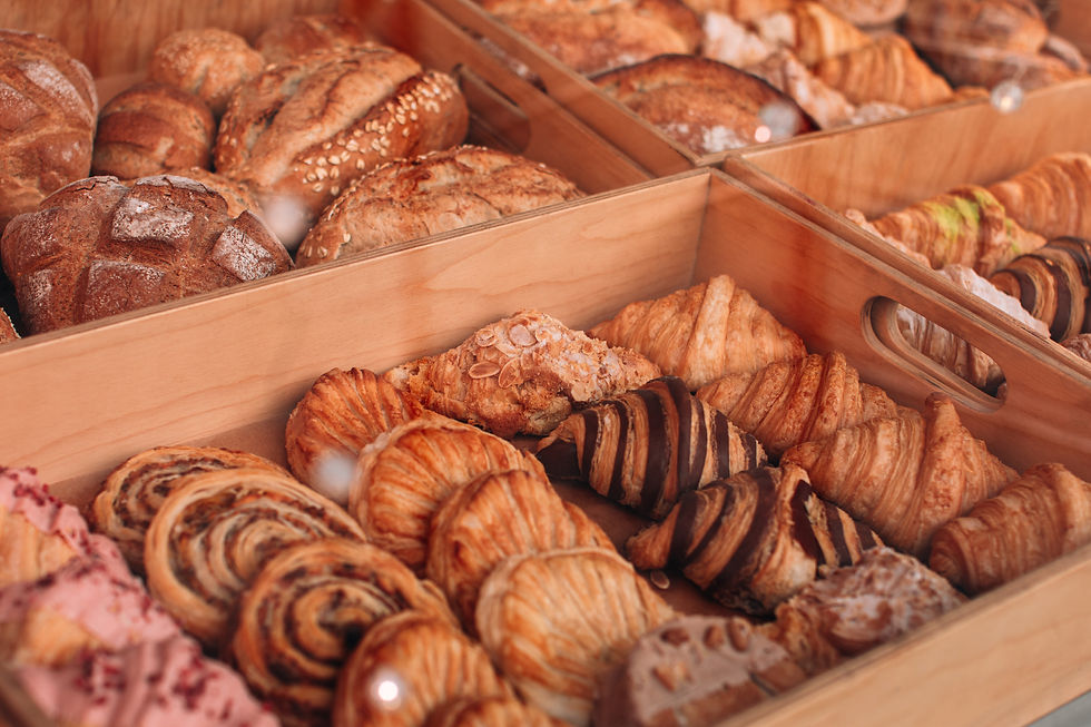
A Little About the Project
Crust is a sustainable bakery based in the outer Bristol area, serving up high-quality handmade baked goods for a modern, eco-conscious community. With a focus on sustainability, they work with local farmers for fresh flour, eggs, and milk, use responsibly sourced chocolate, and make their own homemade jams - entirely everything they offer is as ethical as it is delicious.
The branding captures Crust's warm, earthly feel. The logo and sub-marks use a lowercase serif typeface with rough edges to reflect the natural imperfections of baked goods - just like the crust of freshly baked bread. The carefully curated colour palette uses red undertones to create warmth and an earth-like quality, while the imagery highlights natural textures, the handmade baking process, and sustainable living.
Crafting the Brand Identity
The work for Crust focused on creating a cohesive brand identity that reflects its sustainability and community values. This included desiging a logo and sub-marks, a reimagined business card, and eco-friendly packaging made from recycled board and ink, completely free of plastic. Each design element emphasised the bakery's commitment to sustainable practices while maintaining a visual connection to local, handcrafted quality.
To minimise environmental impact, Crust reduced print materials and focused on digital strategies. I produced social media adverts and templates to share the brand's story and engage with an eco-conscious audience. Additionally, I developed an easy-to-follow social media plan to ensure consistent communication with the community. These efforts reinforced Crust's sustainable ethos and positioned it as a modern, trusted bakery in the vibrant outer Bristol area.
Digital-First and Sustainable Strategies

The Crust logo uses a lowercase sans serif typeface with semi-contrast and rough edges to create a natural, approachable feel. The lowercase lettering keeps it friendly and down-to-earth, while the rough edges add character, nodding to nature and imperfection—just like the crust of freshly baked bread. This ties beautifully to the bakery’s commitment to authenticity and sustainability, reflecting its focus on honest, handcrafted products.


The Four Vs
Voice
Approachable, honest, and warm. It speaks directly to the community, celebrating the care and craftsmanship behind every product. The tone is down-to-earth and authentic, reflecting the brand's connection to sustainability and tradition.
Values
-
Quality: Only the best ingredients, sourced responsibly.
-
Sustainability: Minimising waste and supporting eco-friendly practices.
-
Community: Building relationships with local farms and customers.
-
Authenticity: Honest, handmade baked goods made with care.
Vision
To be trusted, sustainable bakery that connects people with the earth and their community through thoughfully made baked goods. Crust aims to inspire a deeper appreciation for local food and mindful consumption.
Visuals
Simple and texture-rich, with earthy tones and a retro-inspired aesthetic in some advertisements. The visuals evoke warmth, natural imperfection, and a sense of place, emphasising sustainability and the handmade nature of the products. Designs focus on textures like wood grain, and paper, with clean layouts to maintain a modern edge.
A Little About the Project
Crust is a sustainable bakery based in the outer Bristol area, serving up high-quality handmade baked goods for a modern, eco-conscious community. With a focus on sustainability, they work with local farmers for fresh flour, eggs, and milk, use responsibly sourced chocolate, and make their own homemade jams - entirely everything they offer is as ethical as it is delicious.
The branding captures Crust's warm, earthly feel. The logo and sub-marks use a lowercase serif typeface with rough edges to reflect the natural imperfections of baked goods - just like the crust of freshly baked bread. The carefully curated colour palette uses red undertones to create warmth and an earth-like quality, while the imagery highlights natural textures, the handmade baking process, and sustainable living.
Crafting the Brand Identity
The work for Crust focused on creating a cohesive brand identity that reflects its sustainability and community values. This included desiging a logo and sub-marks, a reimagined business card, and eco-friendly packaging made from recycled board and ink, completely free of plastic. Each design element emphasised the bakery's commitment to sustainable practices while maintaining a visual connection to local, handcrafted quality.
Digital-First and Sustainable Strategies
To minimise environmental impact, Crust reduced print materials and focused on digital strategies. I produced social media adverts and templates to share the brand's story and engage with an eco-conscious audience. Additionally, I developed an easy-to-follow social media plan to ensure consistent communication with the community. These efforts reinforced Crust's sustainable ethos and positioned it as a modern, trusted bakery in the vibrant outer Bristol area.
Packaging

This packaging perfectly complements Crust's pastry offerings by combining functionality with sustainable design. Made from recycled board and free of plastic, the box reflects Crust's commitment to eco-friendly practices while maintaining an elegant, artisanal aesthetic.
The natural kraft texture ties to the handmade quality of the pastries, while the red wheat illustration adds a subtle nod to the brand’s roots in traditional baking. This packaging not only protects the product but also enhances the overall experience with its thoughtful, earth-inspired details.

This packaging perfectly complements Crust’s bread loaves by combining simplicity, practicality, and sustainability. Made from recycled kraft paper, it protects the loaf while highlighting its artisanal quality through the natural texture of the material.
The vertical typography of the logo adds a modern touch while keeping the design understated, allowing the bread to be the star. The open-top design not only makes it easy for customers to see the fresh, golden crust but also evokes a market-style authenticity.

Including sourcing information on the back of the card sets Crust apart from the usual business card setup. Instead of just contact details, it tells a story—highlighting local partnerships and the bakery’s commitment to sustainability, giving customers something meaningful to connect with.


Adverts and Social Media
The adverts and social media showcase Crust’s commitment to sustainability, authenticity, and community connection.

These adverts capture Crust’s essence with warm, inviting phrases like “Feels Like Home” and “Start Here,” evoking comfort and connection. The focus on natural textures, earthy tones, and handmade goods highlights authenticity and sustainability, while the imagery fosters a sense of community and quality.


Photography
Direction

%20%7B%20%20%20%20animation-timing-function%20cubic-bez.jpg)

